Hangify
Hangify is an online platform that brings people together in the real world. Discover and keep track of everything in your social life, from upcoming concerts and club events to hangouts with friends at your favorite places. Want to see who is interested in grabbing dinner tonight? Just post to your private circle of friends. What's going on this weekend? Discover events on and around campus. Organizations love using Hangify to promote public events and easily schedule private meetings with a group of members.
Hangify
Founder & Head of Product Design
summary
Hangify was a mobile platform that connected students with experiences on and around campus. Students could find everything from free food, to parties, concerts, performances, sporting events, and more. The platform was available on iOS and Android.
role
I founded Hangify and served as CEO & Director of Product Design. On the product side, I was responsible for the product specifications, roadmap, designs, and managing implementation with a team of engineers and designers I recruited and directly managed. For operations, I recruited and managed a COO and CPO (Chief of Platform). As the CEO, I led the company vision, raised money and managed investor relationships, and managed the company budget.
Highlights
Within three weeks of the iOS launch, students used the app over 50,000 times at two universities.
Average user base growth of +32% MoM for the first 6 months after app launch.
Raised angel funding with assistance from Scott Kosch, a Techstars mentor.
Rapidly iterated to improve product-market-fit, releasing 30+ versions in 6 months.
Partnered with local businesses to drive sales at retail locations; first promotion brought 150 customers to a single partner store in 4 days.
Managed team of 26 across the country.
Hangify Mobile Redesign
Introduction
Hangify began as a web-only platform as we initially beta tested the concept and wanted to make the platform quickly accessible on multiple devices. After we validated the product with our web version, we made the decision to move to a mobile-first approach and release native apps for iOS and Android. This decision made sense given how much traffic was coming from mobile devices, the advantage of using mobile push notifications to engage users, and the low expected loss of total traffic from retiring our desktop version. Coming from the initial version of our web platform, we had a few key things we wanted to accomplish with our redesign and move to native-mobile, which frame how I approached this redesign.
Business Goals
As a web platform, we measured several major user behaviors:
Users would often access our website on mobile looking for events and things to do right now, as opposed to searching for the future (later in the day, week, weekend, etc.).
While we had excellent engagement with email marketing (open rates above 50% with click through rates above 20%) that would drive users to the site to check out specific events and browse, we had poor retention / recurring usage when a user wasn’t prompted by an email or social post.
We were having difficulty showing and recommending the most relevant content to users, because we weren’t collecting enough data around whether users were interested in particular events or whether they attended.
Based on these trends, we had these goals going into our redesign:
Focus the main user experience on events and activities happening right now or in the near future. Design question: “How can we get a user to discover an actionable event they’re interested in as quickly as possible?
Increase recurring usage by using native-mobile push notifications and other gamification methods in-app.
Improve the relevance of content by (a) collecting more data on user preferences and (b) using that data to generate personalized recommended events.
These goals supported both a better user experience based on our research and supported our business by building a stronger recurring user base to excite Series A investors.
With these design goals, we wanted to specifically increase our number of weekly active users (WAUs) as a percentage of our user-base and help drive an overall increase in registered users. In terms of a specific target, we knew we needed it to be game changing, so any result would have to be a multiple of our previous metrics to consider the launch a success.
Research
The goals above were informed by research and data collection we did in several areas:
We tracked usage data for our platform in google analytics to understand things like mobile vs. desktop usage, popularity of content, errors, etc.
We conducted in-person user research to understand user pain points and opportunities to improve both the feature set and usability of the platform.
We conducted user surveys to collect quantitative data around usefulness of the platform and to identify opportunities for product improvement.
Design approach
At the time we were doing this redesign, a popular mobile email client called Mailbox (later acquired by Dropbox) had established an interesting design pattern that seemed like it had a lot of potential for Hangify.
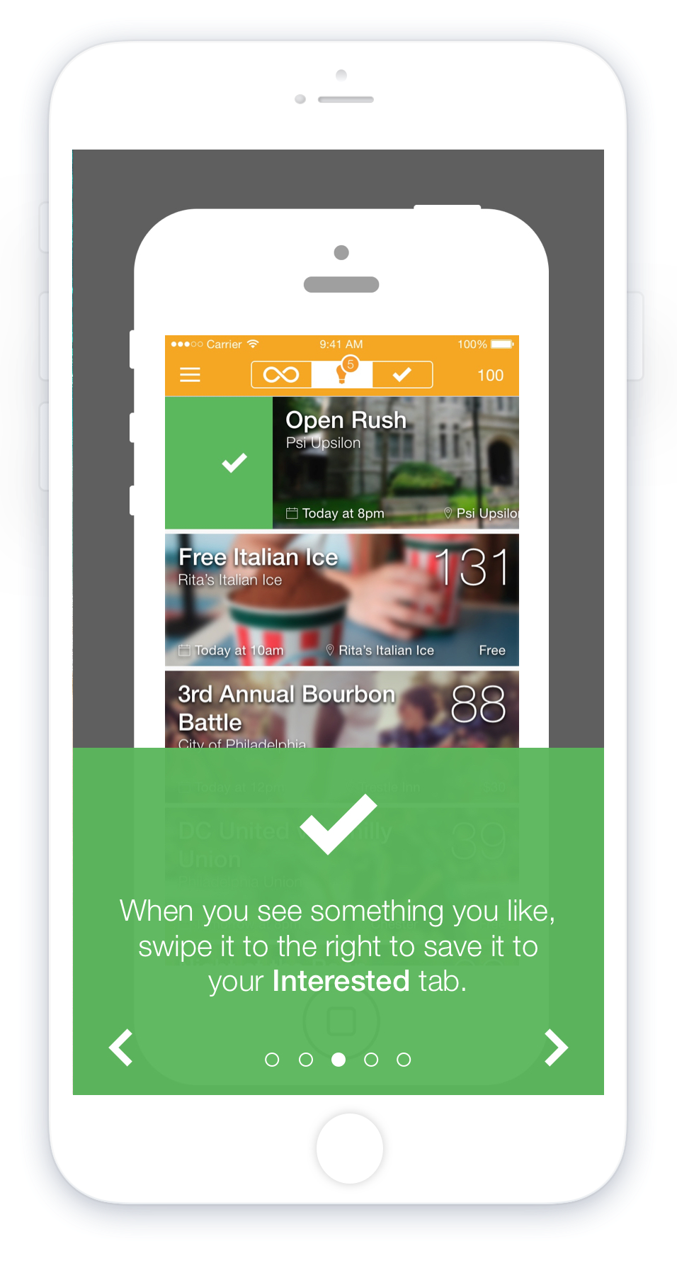
I saw the potential to use the concept of an inbox to give users recommendations that they would then “sort” by indicating whether they were interested or not interested. This both created an opportunity to gamify regular use of the platform by adding a notification badge for the number of unsorted recommended events, and it gave us additional data points we could use to improve future recommendations and platform content.
We also adopted the top bar tab approach that Mailbox used to manage switching between lists, and we’d default to the “everything” list that is sorted by date as the initial experience, to help users find immediately relevant content as quickly as possible.
IOS designs
All designs for this project were created by me. The onboarding flow for our mobile app effectively describes how it works along with showing the core interface:


impact
The switch to mobile had a huge impact on our success metrics. Though it’s difficult to isolate the value of the platform shift / UX improvements alone from the rest of the marketing activities we engaged in after the app launch, we 4x’d our user-base in just 3 months after the app launch. And on weekly active usage (our main stickiness metric), we went from 13% WAUs of total users on the website to 37% WAUs 6 months post app launch. Engagement on push notifications was huge, with 30% to 70% of recipients opening notifications depending on the message. And with these notifications, users were taken to content they could engage with in the app immediately, so this rate is most comparable to the ~20% CTR we had with our email marketing messages.
Overall, we saw the giant leap (multiple x) we were hoping for in our success metrics, which led us to evaluate this as a very successful product launch.